Visual direction
Shape a Distinct ai poster for aesthetic Projects
An aesthetic can be easy to recognize but hard to describe. Aiposter helps you turn a specific mood, palette and focal point into an ai poster concept you can refine before adding final text.
the scenario's pain
A mood board may contain beautiful references without explaining which choices should survive in the finished poster.
3 concrete workflows
Choose a workflow based on what you already have: a mood, an image or a series that needs a shared visual language.
-
1
Build from a mood
For a café event, describe warm evening light, espresso brown and faded apricot, a single cup silhouette and ample room for the event name. Generate an ai poster concept, then compare whether the result feels intimate rather than crowded. If it misses, change one variable at a time: lighting, palette or subject, not all three.
-
2
Translate a reference image
For an artist announcement, start with a photo you are allowed to use. Identify its strongest feature—perhaps a deep-blue shadow—and ask for an aesthetic composition built around that color while preserving a clear area for the artist's name. Treat the generated image as a design direction, not proof that the original photo's details will remain intact.
-
3
Create a matching series
For three community screenings, repeat the same ai poster brief for type placement, margins and background texture. Change only the featured object and accent color for each screening. Review the results side by side; regenerate any outlier whose contrast or focal-point scale breaks the series. Add exact dates and venue details after the visuals are settled.
example output
A useful comparison asks whether the visual communicates the intended mood while leaving practical space for the message.
- Starting direction
- Mood-led concept
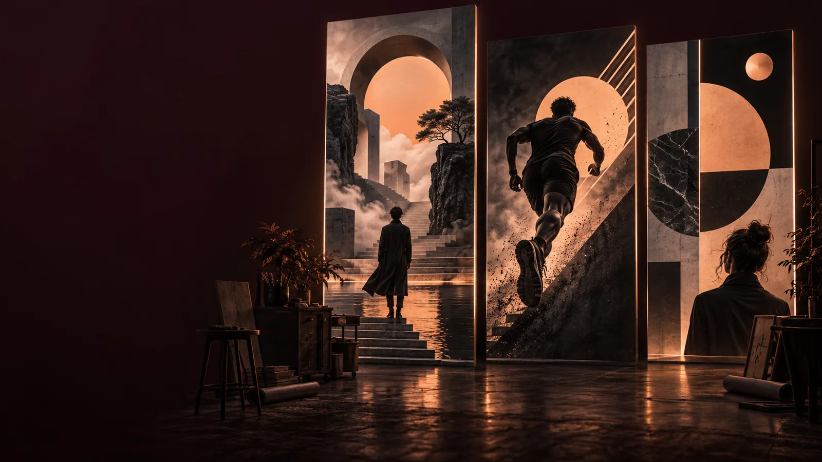
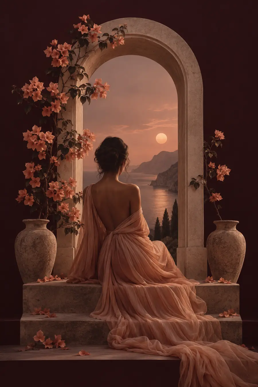
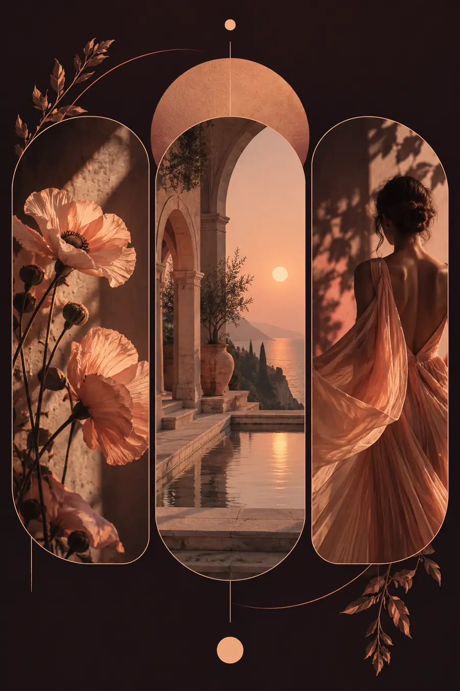
Read this pair as a visual-direction example, not a guaranteed transformation of the first image. When reviewing an ai poster for aesthetic use, look for a deliberate focal point, a restrained palette and enough quiet space for a legible title. A stronger atmosphere is not automatically a better poster: test it at the size and background where people will actually see it.
compliance notes
A generated aesthetic is a starting point, not a substitute for checking accuracy, permissions and readability.
-
Exact wording is not dependable
Image generation can distort letters, dates, names and small labels. A convincing ai poster preview may still contain unreadable or incorrect event information.
WorkaroundGenerate the visual with a clear text area, then place and proofread final wording in a layout editor.
-
References may have usage restrictions
An aesthetic reference found online is not automatically yours to reproduce. Logos, recognizable artwork and other people's photographs may require permission.
WorkaroundUse material you own or have rights to use, and describe general traits such as color and lighting instead of requesting a close copy.
-
Visual coherence does not ensure accessibility
Subtle color pairings and tiny type may suit a mood board but fail on a phone screen or printed notice. Check the ai poster at its intended viewing size.
WorkaroundKeep essential text separate from busy imagery, increase contrast and test a small-screen or print-size preview.
-
A style prompt cannot guarantee consistency
Repeating the same description can produce different framing, texture or subject details. That variation can disrupt an aesthetic series.
WorkaroundRecord the palette and layout rules you want to preserve, then select and adjust each result against the same checklist.
scenario FAQ
Specify the intended mood, a limited palette, the main subject and the amount of space needed for text. Add lighting or texture only when it serves the idea. A clear ai poster prompt gives you more useful results than a long list of unrelated style words.
Yes. Start with a written description of the feeling and composition you want, such as a quiet editorial layout with soft shadows and one central object. Review the first result for hierarchy before refining smaller aesthetic details.
Reuse a short set of visual rules: palette, title position, margin size, texture and focal-point scale. Change only the subject or one accent color between posters. Compare the ai poster concepts together rather than approving each in isolation.
Do not rely on generated lettering for final event details. Reserve an uncluttered area in the image, then add the exact name, date and location in a layout editor. Proofread a preview at the size your audience will see.
Review the image before publishing, especially any recognizable artwork, logos or reference photos you supplied. Confirm that you have permission to use those materials and check that the final poster's information is accurate and readable.